
Good typography and using the best font pairs can take a design from dull to delightful. Effective type combinations add visual interest to a design that can keep a potential customer more engaged. Bad type, by comparison, can make content harder to read and less pleasing.
The intent of typography is to portray a feeling about the content, and therefore, the product or service the user is about to read about. If done correctly, it can generate a hugely favorable response. For example, a bold, tall and blocky font can help to inspire confidence in the product. Pairing it with a curvy and sensual script can add an element of sophistication, helping to make the product/service be perceived as higher end.
Learning to combine fonts effectively is a skill that continuously needs to be refined. Experienced designers can make the simplest design more effective.
But where do I start?
Following basic ground rules for combining fonts is the best place to start. Once those “rules” are mastered, you can experiment to create endless combinations!
Rule #1 – Look at Font Characteristic
Understanding the characteristics of different fonts is the first step in learning how to combine them appropriately. Study the weight (thin, bold, black), style (regular, italic) and classification (serif, san serif, script, display) of some of your most-used typefaces. Then think about the similarities and differences in these typefaces.
Rule #2 – Think Contrast
Properly using contrast when combining typefaces can be tricky. Too little contrast can make them clash, and too much contrast can do the same. Your job is to find the happy medium.
Try to focus on the contrast between only one or two of characteristics just mentioned, while making sure the others are very similar. Weight is one of the easiest ways to create contrast between fonts!
Rule #3 – Practice Makes Perfect
Experimentation and practice are where you can polish your font combination skills and create designs that are engaging, beautiful, and effective. Listening to your intuition is often the best way to create a typeface pairing that takes your design to the next level!
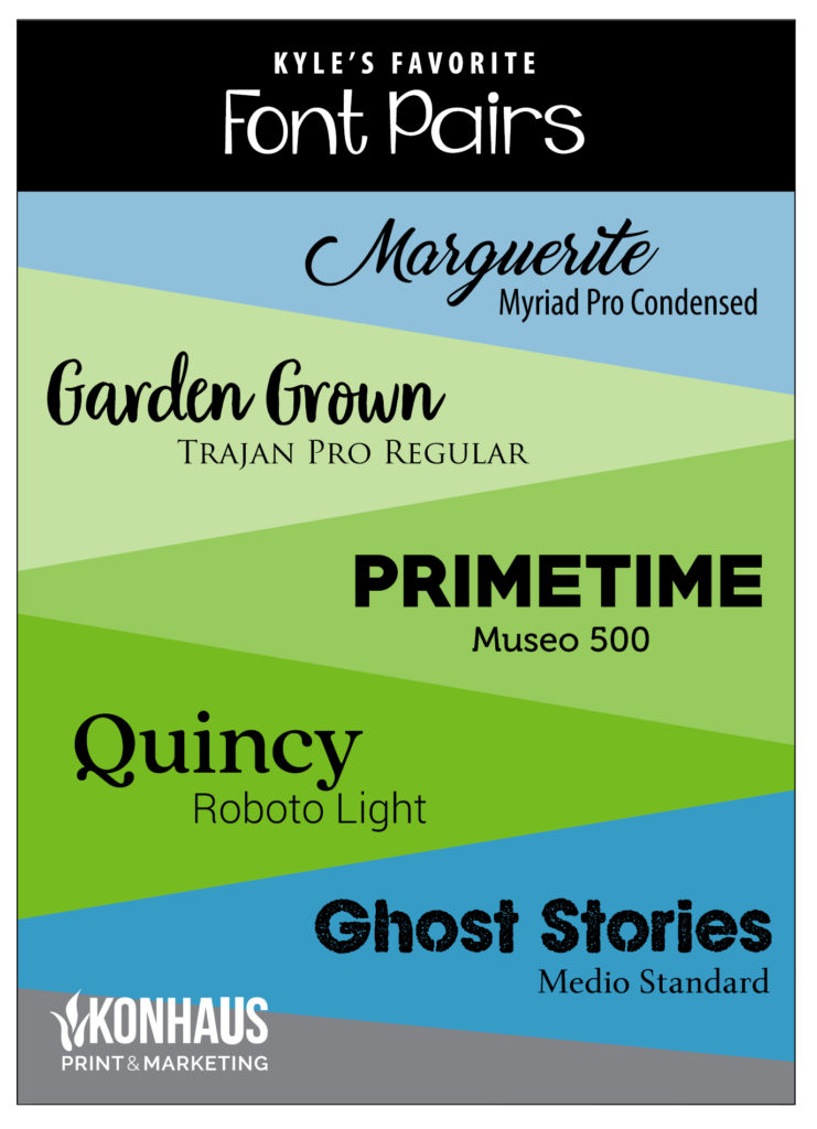
Here are a few of my current favorite font pairs to use on design projects:

By Kyle DeMartyn, Creative Director
Leave a Reply