Top Tips to Break the Mold with Your Brochure
 Getting a new client, customer, or donor is all about show and tell. A great way to do both is to have an engaging brochure as part of your toolkit. Brochures are extremely versatile because you can use them at sales meetings, on retail counters, at trade shows, and in your direct mailings. Many businesses and organizations make the mistake of keeping the same brochure for 3-5 years. If you really want to grab attention and best promote yourself, you’ll want to look at updating the look and feel. Don’t know where to start? Read more about how you can make your brochure knock the socks off of your prospects below.
What is the purpose of your brochure? The way you write and design your brochure will all be tied into this question. If you already have ten things you want it to do, then you seriously need to pair it down to no more than 3 things. For example: Captivate. Inform. Purchase.
Create a captivating cover. This is your first impression. Within a second of seeing your cover, a person will decide if your information is worth their time. Catch their attention with rich colors, clear images, and minimal text.
Keep readers engaged with creative content. Get your purpose across in an engaging and concise way. Take a tip from our content-guru Mary and imagine you are having a conversation with your ideal customer. Focus your content on benefits, not your features to make a personal connection with your reader.
Don’t write your life story. Have you ever been in a conversation that was completely dominated by the other person? Your text can give the same impression. Keep your text concise and on message. Having too much text can immediately make your customer disinterested in what you have to say. Think clean and easy for the eye to read.
Break up blocks of text with engaging images. Good stock photography is okay to use in your brochure. If you have the ability to capture unique images, choose them over stock ones because they can help you stand out among your competitors. Showing a behind the scenes look into your company helps readers feel like they are a part of your
Fonts are your friend. Be more memorable by not using everyday standard fonts. Mix fonts that represent your business personality and grab attention. Don’t overdo it though, because it can come across as inexperienced or unprofessional. A good rule of thumb would be no more than three different fonts.
Include a clear call to action. This is where knowing your purpose ties everything together with a nice little bow. You’ll want to make sure you ask your reader to take an action. It can be as simple as picking up the phone or visiting your website.
Related Articles:
7 Ways to Keep Your Business Card Out of the Trash
Top 25 Envelope Teasers
Segment Your List for Marketing Success
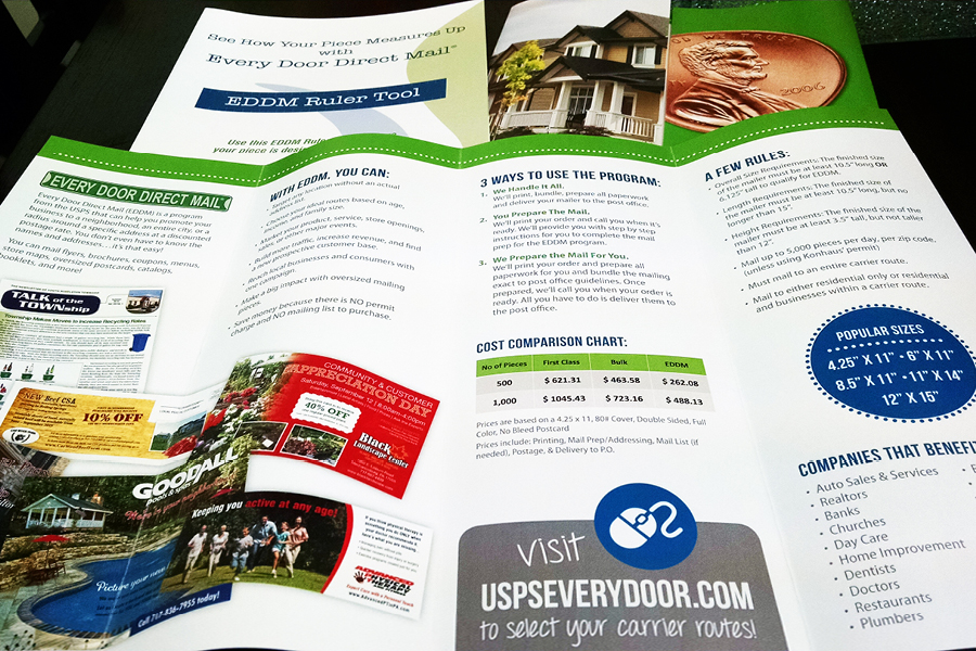
Need some inspiration? Here are two of our brochures about Every Door Direct Mail (EDDM) – one with general information, and one that doubles as a EDDM Ruler.
