By Kyle DeMartyn, Konhaus Creative Director

Summer, summer, summer…I’ve waited so long for you. It’s finally time to work summer fresh fonts into your layout!
Who knew the upward swoosh of a serif could change the whole feel of your text? I have spent years noticing font choices in essentially everything, from event posters and product packaging, to credit card bills, traffic signs, and billboards – you name it! At this point, it’s an obsession that’s out of my control.
I’ve developed a passion for type and choosing fonts that not only meet a need but complement a design to perfection.
Choosing the right font
The sheer number of fonts available to us can be overwhelming.
Here are some basic guidelines for choosing the right font:
- Keep fonts clean and simple for readability in heavy text areas like body copy.
- Limit more complicated, decorative fonts (like my favorites below) to headlines and graphics.
- Consider the usage. Billboard? Simple and bold (you have only seconds to capture attention). Fundraising appeal? Try incorporating a handwritten look for a personal feel.
- Consider the audience. Older adults? Simple, clean fonts work best. Gen X? Choose fonts that create nostalgia.
Kyle’s top summer fresh fonts
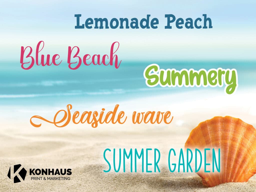
Here are some of my favorite summer fonts you can try out (in no particular order):

It is not always about choosing the right or wrong font, sometimes it’s about taking a chance and trying something new. You may discover a fresh font pairing, and if you’re like me, that just might make your day!
Reach out
We can help you decide on fonts and much more for your design project. Connect with us about your design needs at [email protected]!
