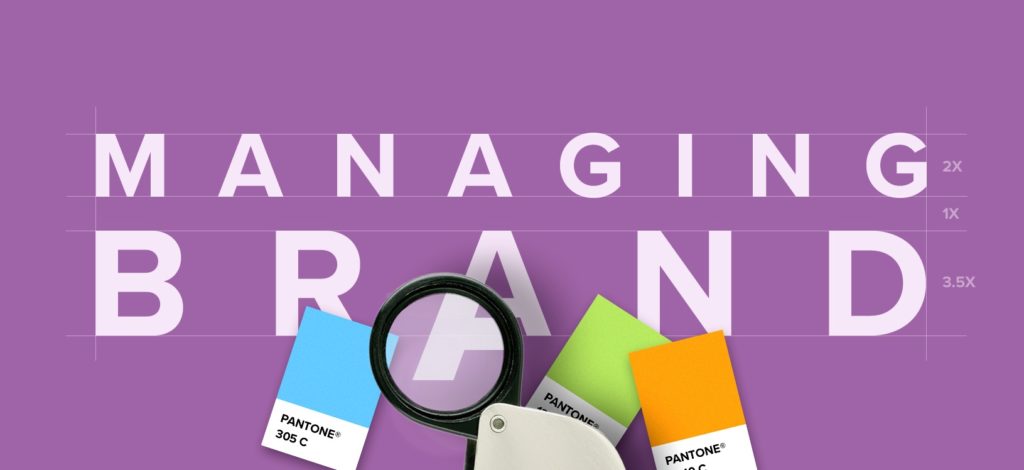
When designing a logo or other printed marketing material, one of the most important things to be aware of is the use of colors and how those colors will be translated when printed. It is critical to have color consistency within your brand.
The CMYK color model uses four colors (cyan, magenta, yellow, and black) in combination to print the desired color. However, there is a chance of your color looking a little different each time it prints, depending on the calibration of your printer. For example, the blue you intended to print may come up a little lighter/darker than expected.
If printing only one copy of something, this inconsistency doesn’t matter much. But if you’re printing business cards for all your employees, “close enough” just isn’t good enough. They all need colors that match, thus keeping your brand consistency.

How Important is Pantone? Pretty Darn IMPORTANT!
Pantone is a standardized color matching system (Pantone Matching System, aka PMS), used to identify colors. Pantone colors (sometimes called “spot” colors) are referenced by a number or name. There is a predefined color that should be printed when using a Pantone color. This can be checked against a Pantone swatch book to be sure colors match. By standardizing the colors, different vendors can all reference a Pantone color, making sure colors match, even if they are on different sides of the globe. By having a select Pantone color, you are able to keep your brand’s logo consistent when it comes to printing.
Since color dramatically increases brand identification (which, in turn, can boost sales and engagement), it’s crucial that color remain consistent across all expressions of the brand, whether online or in print.
Want to chat colors for your brand? Contact us at [email protected]. We love to talk all things design!
Kyle DeMartyn – Creative Director
