By Kyle DeMartyn, Creative Director 
Type fonts…so many choices, so little time. My obsession started back in Mr. Bollock’s typography class freshman year at KU (go Golden Bears!). Who knew there were so many fonts?! Who knew the upward swoosh of a serif could change the whole feel of your text?! I knew I was hooked. Since then, I can’t help but notice font choices in virtually everything…event posters, product packaging, credit card bills, traffic signs, ads, magazines, billboards, you name it. It’s an obsession that is out of my control! Having years of experience in graphic design has helped me realize which fonts work, and which ones don’t. I’ve developed a passion for choosing fonts that not only suffice but complement your design to perfection.
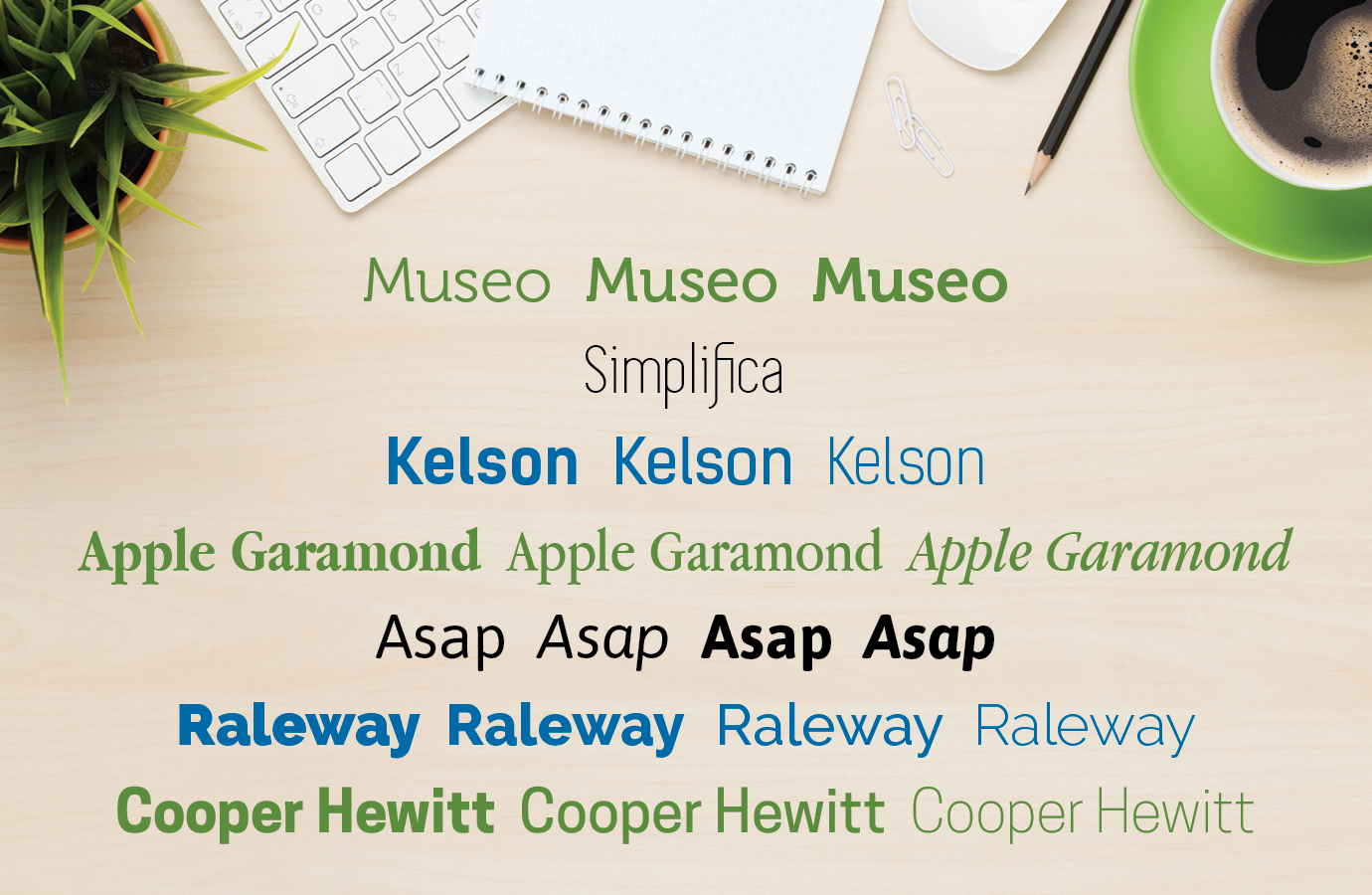
Here are some of my recent favorites for clean, simplistic, modern design:

Museo- https://www.wfonts.com/font/museo
Simplifica- https://www.behance.net/gallery/14209843/Simplifica-(Free-Font)
Kelson- https://www.wfonts.com/font/kelson-sans
Apple Garamond- https://www.dafont.com/apple-garamond.font
Asap- http://www.1001fonts.com/asap-font.html
Raleway- https://www.1001freefonts.com/raleway.font
Cooper Hewitt- http://www.1001fonts.com/cooper-hewitt-font.html
Keep fonts clean and simple for readability in heavy text areas like body copy, and introduce more complicated, decorative fonts in headlines and graphics. An exception to this rule is billboards and banners that will be viewed from a distance – limit these to simple, easy to read fonts since view time is usually only seconds.
It’s not always about choosing the right or wrong font. Sometimes it’s about taking the chance to try something new. You may discover a fresh font or a new pairing, and this might just make your day like it would mine.
