Submitting files for print can be confusing and even feel daunting. JPEG. PDF. HUH? And what in the world is bleed? Sounds a little scary…
It’s not!
We want to make the process as painless as possible, and maybe even FUN. Here are some quick tips to help you get that perfect print with Konhaus Print & Marketing (or anywhere, really).
1. Want color to the edge? Add bleed!
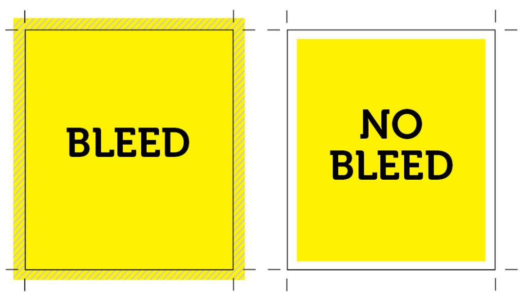
If your design has color to the edge of your sheet, then “bleed” is required. Bleed is when a document is printed slightly bigger than required and is then trimmed back to the original size after printing. This ensures that your final product does not have an ugly white edge along the sides.
At Konhaus, we require .125” of bleed on all edges, so if you are printing an 8.5 x 11” document, we need the design files to be 8.75 x 11.25”. Keep in mind that .125” will be cut off each side, so be sure you do not have any pertinent info too close to the edges.
Pro Tip: If you intend for your printed piece to have a white border where nothing on the sheet goes to the edge, bleed is not needed. Crop marks are still helpful!

2. Use caution when grabbing photos from the web
The internet oftentimes uses images that are only 72 dpi (dots per inch). For printing, 300 dpi is typically required if you expect your image to appear clear and crisp. Using a 72 dpi image taken directly from the web, and imported into your document at the same size you need it, is likely to be too low resolution. This will cause it to print blurry and pixelated.
3. Pantone for print and you won’t miss
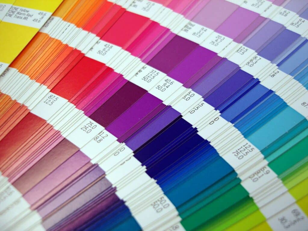
We recommend that you use Pantone colors when designing your logos and other components for print. Pantone are spot colors belonging to a standardized color reproduction system – the Pantone Matching System (PMS). PMS was established to create consistency throughout multiple printed products.
Pantone provides a universal language of color, and using a Pantone color ensures your logo (and your brand) remains consistent throughout all printed items.
Learn more about Pantone and how to use it.

4. There are plenty of file formats in the sea (but that doesn’t mean they’re all right for you).
If you’re sending us a design to be printed, we always prefer PDF files.
The biggest advantage of sending a high-resolution, print ready PDF file to your printer is that there is almost nothing that could go wrong with the file (if the file is created properly). Here’s why:
- Text and graphics will remain how they were designed.
- Text will not reflow because of missing or incorrect fonts.
- Images do not have the chance to relink incorrectly, and you can see how the file will print by viewing it on your computer.
Pro tip: Remember to include crop marks and/or bleed, if applicable.
5. “We need a [high] resolution.”
The great Aaliyah sang, “We need a resolution.” But which resolution is the right one?
Pro tip: Always pay attention to resolution when exporting native files to PDF.
For good print reproduction, files should be saved at 300 dpi. Less than 300 dpi means your artwork may print blurry or pixelated. Always use the “high quality” option when exporting your art to a PDF file.
Also, be sure to save your artwork at the size it is to be printed. If you supply artwork that is saved at a small size and you want it printed larger, then things can go horribly wrong! We can scale artwork down in size, but we can’t scale it up without a loss of resolution (and good resolution is what makes the image crisp and sharp).
Let’s do this!
Have questions when preparing to submit your artwork? Reach out to us! We are here to help and want your final piece to look exactly as you imagined it (or better)!
By Kyle DeMartyn, Creative Director
